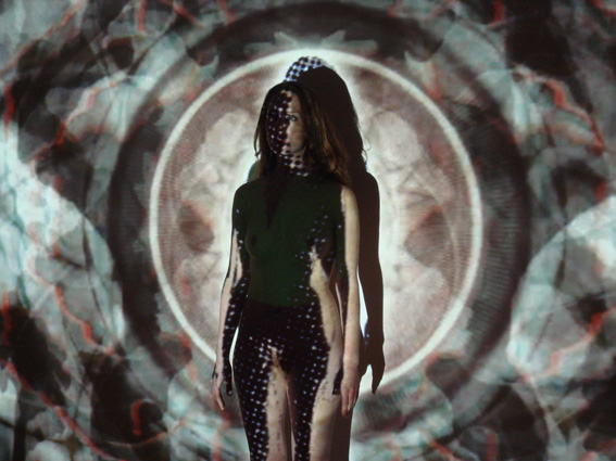
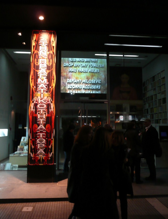
‘UR Text’, 2006, Mark Titchner. Duration 04:48.
Tag Archives: Mark Titchner
COMPLETE VIDEO WORKS – ‘UR TEXT/HER TEXT’, 2007.
‘Ur text/Her Text’, Mark Titchner, 2007. Duration 05:46.
A version of this work was performed by Natalie Press and Martine McCutcheon at the Whitechapels‘ ‘Art plus Drama 2007’.
COMPLETE VIDEO WORKS – “BEDTIME FOR NECROMANCY’, 2004.
‘Bedtime for Necromancy’, Mark Titchner, 2004. Duration 2:52.
URBAN SIGILS
This text was originally produced for the 2nd Issue of the Abraxas journal being the extension of an idea first presented during the ‘Dark Monarch’ exhibition at Tate St Ives in 2009.
The text is presented here to give some further context to my motivation in presenting the exhibition ‘Murmur become ceaseless and myriad’ at Flat Time House which runs until 30th October 2011.
‘There is only one resource to avoid the horrors of daily life…never raise your eyes.’
JK Huysman, ‘La Bas’.
Our cities teem with symbols. An incessant, rapid succession of products and ideologies to batter the urban senses. Private interest invades what we call public space; from the back of a bus ticket to high-resolution video screens. Into this space, from without are flung images of desire and aspiration, a commanding pulse, More! More! More! Streets filled with gaping mouths and unblinking eyes, it pours in, this other will, an unheralded fact of the urban experience. The public sphere as Laboratory.
A Hypothesis of sorts; what is there to do in the face of this barrage but to disengage, to become porous, to be neither here nor there, to let go. A number of years ago I began to consider that there could perhaps be a potential analogy between this kind of urban sleepwalking and the labour of consciously ‘letting go’ in the Sigil process. Could this collective act of capitulation be used to activate such a thing as a Public Sigil?
During the 1980’s The Temple of Psychic Youth initiated it’s project to extend the creation of Sigils from the individual to part of a collective Gnosis. My idea was simply that because of the very particular situation that media over saturation creates it could be possible to introduce collectively produced Sigils effectively back into this very site, occupying the spaces where we would expect to find advertising.
Further whilst it is perhaps impossible to produce a truly representative group Sigil the collective wills and desires upon which the Sigil is based are clearly defined. This material is willingly given, courted in Focus Groups and Strategic Planning meetings and often made a matter of public record. This material that is willingly produced to improve the consumer/social experience is the material from which the Sigil is derived. It is this that will be hidden in plain sight amongst the very media that have borne it.
‘The deepest secret is always hidden even though it be openly to the public or cried from the rooftops’, AOS.
(I’ve most recently revisited the Sigil in public works with the works that I contributed to the campaign against the Governments budget cuts to the arts. In these works the sigil aspect of the image have become part of the overall noise and static of the image rather than the main visual component. So much noise to make a silence.)
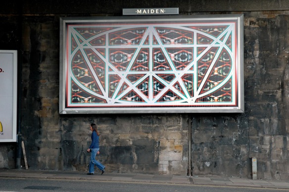
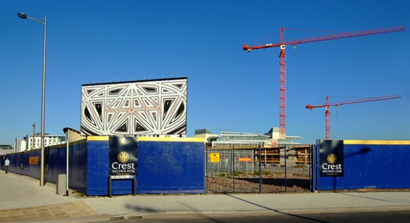
As part of my contribution to the British Art Show 6 I was commissioned to produce a series of Billboard based works in Newcastle during the exhibitions display at Baltic Centre for Contemporary Art. At this time the city was involved with a renewal program called ‘The Newcastle Plan’. One key aspect of the strategy for this plan was public consultation; during the first consultation the public identified four points as areas for concern or skepticism. My project took these four demands and presented them in Sigilised form in the city itself.
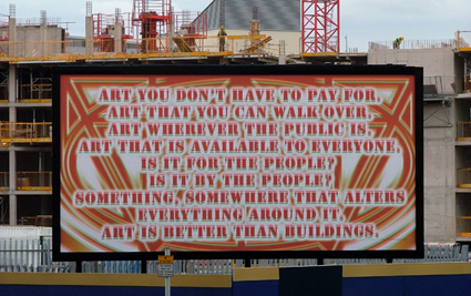
A video work commissioned by Creative Time in New York that ran on a video screen in Times Square for the 59th Minute of every hour. In response to the incredibly overloaded nature of the setting, which literally crawls with information and advertising, the work combined a set of imperative commands and flashing images to play upon the idea subliminal influence. Ironically to make a work that plays upon this fear, images and text had to operate at speed far slower than a truly subliminal one whilst appearing fast enough to trigger the idea of manipulation in the viewer. The coda for the work was the phrase ‘Just tell me what you want me to do’.
One aspect of the Public based Sigil works is to emphasise the contested nature of ‘Public Space’ given the influence on it by private interest. In order for these works to have the same kind of duration and quality as regular advertising, and thus engage with the fabric of the city, these projects always begin with negotiation and the purchase of space. The interest is to use these sites or even the vernacular of advertising itself in a way that strikes the viewer as dissonant whether it is consciously experienced or not.
‘Thought is a Signal’ was a project I made in collaboration with a group of young people in Bristol. The project focused on strategies by which the individual may express their opinions or feelings in a public setting. This particular work worked as an announcement for the group with later billboard Sigils reflecting attitudes towards Public Art, exclusivity and Consumerism. The final work in the project was an alternative Audio guide for the British Art Show 6 in which the group impersonated the artists in the exhibition and talked about the intentions behind the work.
The first of the Sigil based works and really a simple attempt at Self-Portraiture, with the work as a simple Sigilised form of my name. (The aspect of Self-Portraiture was emphasized by the liberal amount of my blood that was mixed into the paint applied to the carving.) It was also an attempt to formally announce an area of interest within my practice, a degree zero. There is a certain contemporary tradition of the artist announcing their rebirth, for example in Jeff Koons airbrushed Artforum ads for himself or John Baldessari’s artistic purge with his “The Cremation Project” in 1970. This figure has continued to be appear in my work ever since.
My thanks to Abraxas for graciously allowing me to represent this text here.
MURMUR BECOME CEASELESS AND MYRIAD
29th September—30th October ’11
Flat Time House
210 Bellenden Road
London SE15 4BW
020 7207 4845
John Latham and Austin Osman Spare, curated by Mark Titchner.
Flat Time House presents a unique exhibition of work by two artistic visionaries of South London whose art embodied their attempts to connect with the universal. Latham lived and worked at 210 Bellenden Road in Peckham for 23 years until his death in 2006. Spare grew up in Kennington and later lived around the Walworth Road and Brixton. He survived a bomb that destroyed his home and studio during the Blitz and died later, at home in Brixton, in 1956. Both artists dedicated themselves to lifelong idiosyncratic philosophical investigations; one through the occult, the other through science.
Spare developed a personal magic which connects the bodily self and conscious mind – the ‘Zos’ – through the unconscious to a more complex state called the ‘Kia’, which describes something like the whole, or the “fertile void behind existence” (Phil Baker, Austin Osman Spare: The Life and Legend of London’s Lost Artist). Latham’s Flat Time Theory sets out a similar relationship between the personal and the universal by allowing the simultaneous existence of more than one ‘type of time’: the time of momentary, lived experience (the ‘specious present’) coexisting with the void-like ‘omnipresent atemporal score’ of the universe. Unlike Spare’s system of magic, Latham’s theory was offered up beyond the individual, as a salve for all imaginable societal and intellectual differences.
Spare and Latham were also striving, through very different means, to unite language and action; to create a language which would directly correspond to or embody that which it was attempting to describe. Spare used sigils: distillations of words or phrases into graphic ciphers which he employed in his personal magic. He developed a process whereby the sigil (representing a will or desire) bypassed the conscious mind through a practice akin to meditation. Once ‘forgotten’ or lost to the conscious mind, the sigil would germinate in the fertile ground of the unconscious and, at some future time, make manifest the initial desire.
For Latham, the very structure and form of language was divisive and inadequate, obscuring the actions and events it attempted to describe. Much of his work is an attempt to convey his ideas through a non-verbal idiom. He developed a strong visual language that included the spray gun, canvas, glass, wires and pipes, and books. In his titling, and later in his theoretical writings, Latham employed an experimental approach to language; playing with its form by means of wordplay, reversals, and corruptions in order to mold it more closely to the nature of things.
Biographically, the artists have a lot in common: a reticence to engage with the art establishment or the commercial art market; superficial correspondences with the work of their contemporaries but isolation by force of their ideas. The artistic genius of both these artists was, in the main, recognised by their peers, even if the subject of their work was not entirely understood.
In spite of this, discussion of Spare’s practice has largely related to arcana and magic, despite his training in fine art and early mainstream successes. Conversely, Latham’s work has been understood primarily in relation to the conceptual art practices of the 1960s and 70s. This exhibition broadens these perspectives, presenting their work in the context of two parallel experimental practices.
BIOGRAPHIES
John Latham (1921 – 2006), one of the most important British artists of the post-war period, lived at FTHo in Peckham, South East London for over 20 years. The House is now home to the John Latham Foundation and the John Latham Archive, and will be the primary location for a 10-month programme of exhibitions and events exploring the artist’s practice, his theoretical ideas and their continued relevance.
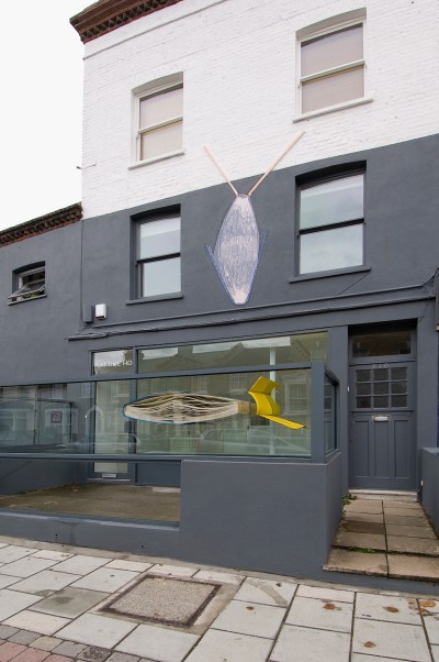
Latham considered the house a ‘living sculpture’, with different rooms taking on the attributes of a living organism. At FTHo, a giant and colourful book-relief sculpture penetrates a large window on the front of the house, known as the Face, into a room called the Mind, in which a permanent installation of works demonstrating Latham’s Time-Base Theory has been maintained. The next room is known as the Brain. Latham described it as the space for ‘rational thought’ and this is where he worked on his theoretical writing and correspondence. The Brain will now be home to the John Latham Archive. The Hand, formerly Latham’s studio, will be the main location for the programme of changing exhibitions and events. The remainder of the house is taken up with what is termed the ‘Body Event’, where eating, sleeping and ‘plumbing’ take place. The name of the house derives from John’s theoretical language, in which ‘Flat Time’ describes the way in which time and all possible events can be represented by the length and width of a flat canvas, demonstrated in works including Time-Base Roller (1972. Tate Collection).
Austin Osman Spare (1886-1956) caused a sensation when he exhibited work in the Royal Academy at the age of just 17. He was lauded for his draftsmanship and was compared to Aubrey Beardsley and Durer during his early successes. His relationship with the establishment soured when his esoteric interests and personal magic became the sole subject of his work and self published volumes. However this did draw another audience to his work; artists, writers and others who shared his interests including, for a time, the occultist Aleister Crowley. His home and studio was destroyed by fire during the Blitz in 1941 and it took spare five years to recover from the injuries he sustained. Later in life, Spare found new subjects among his friends and neighbours around the Walworth Road and Brixton and would exhibit work in his own house, selling his work for around five pounds a picture. He died in Brixton in 1956.
Mark Titchner works in a wide range of media including sculpture, installations, banners, posters, video and performance. He frequently explores the ways in which communication engenders belief and the ways in which our minds can be subtly manipulated. Text commonly features within his work and he draws from a wide range of sources including song lyrics, advertising, utopian statements and political manifestos. Mark Titchner lives and works in London. He is currently exhibiting ‘Be True To Your Oblivion’ a solo show at the New Art Gallery, Walsall and was recently included in ‘Nothing is Forever’ at South London Gallery and ‘The Dark Monarch’ at Tate St. Ives (2010). Titchner was nominated for the Turner Prize in 2006 and has had solo museum shows at the Hellenic American Union (2009), BALTIC, Gateshead (2008 and 2007) and Arnolfini (2006). In 2012 he will have a solo show at the Macedonian Museum of Contemporary Art, Thessaloniki, Greece.
‘BE TRUE TO YOUR OBLIVION’
BE TRUE TO YOUR OBLIVION
8 July – 10 September 2011
(PLEASE NOTE THAT THIS POST IS A WORK IN PROGRESS AND IT WILL BE AMENDED)
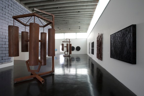
BE TRUE TO YOUR OBLIVION brings together newly commissioned work alongside key works from the artist’s past practice. Ergo Ergot, for example, is an installation which was presented as part of the Turner Prize exhibition at Tate Britain in 2006. Amongst its many influences are the roto-reliefs of Marcel Duchamp and the optical illusions of the Vertigo record label. Be angry but don’t stop breathing was originally presented as part of the Art Now series at Tate in 2003 but has now been reworked for this show. Also on display is a selection of sculptural works including So much noise to make a silence (2008), a pair of gigantic metal wind chimes which are rendered silent through their own monumentality. Sound and silence are recurring themes throughout the exhibition.
(Text from Exhibition Guide)
The exhibition is presented as part of Home of Metal, a celebration of the music that was born in the Black Country and Birmingham.
(All images by Jonathan Shaw, unless otherwise indicated)
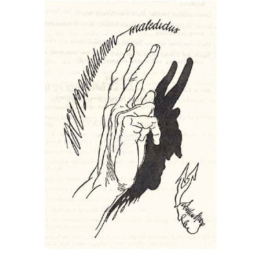
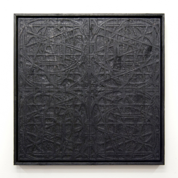
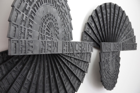
Also included in the exhibition are a series of charred wooden wall reliefs. These hand carved reliefs are given a darker and more sinister edge through their blackened and burned surfaces. The hand gestures and demonic shadow in the work ‘The Other Spring’ originate from a drawing by Austin Osman Spare. Spare was an artist who developed idiosyncratic techniques including automatic writing and sigilization in which words of a statement are reduced to an abstract design. This symbol is then charged with the will of the creator.
(Text from Exhibition Guide)
A further series comprises four works entitled LOVE, AIDS, RIOT and HOPE. The intricately hand carved surface recalls the work of the Arts and Crafts movement as well as Celtic love knots. They are also derived from Robert Indiana’s famous LOVE painting of 1964 and its subsequent re-interpretations in General Idea’s AIDS, Gran Fury’s RIOT (both from 1989 onwards) and finally Indiana’s own re-invention of the work in HOPE (2008) which was used to support the Obama presidential campaign.
(Text from Exhibition Guide)
‘Man, hill, sky, seven days, seven nights’.

'SO MUCH NOISE TO MAKE A SILENCE (MAJOR)', 'SO MUCH NOISE TO MAKE A SILENCE (MINOR)' Steel and fixings, 2008
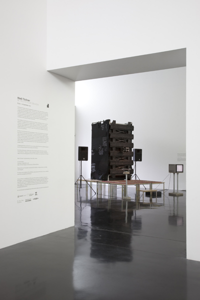
An additional commissioned work is the banner entitled Breezeblock in which digital image manipulation is combined with the raw structure of a breeze block wall. Each of the breeze blocks has been individually rendered and digitally etched with what were originally neologisms (the juxtaposition of two seemingly random words) relating to sound. Neologisims originate from literature, for example, in the poetry of Paul Celan (1920-1970), but it is also common for rock bands to generate their names in this way. Titchner has mirrored the text to create a Rorschach-style design, a stylistic device often found in the visual language of Heavy Metal. The text is now largely indecipherable and bears a resemblance to sigils (symbols associated with magic). Sigils have been particularly influential to the visual style of Led Zeppelin. Many metal bands have embraced a visual style that tends towards the Baroque, encompassing notions of darkness, mystery and magic. Heavy Metal bands have also been associated with subliminal messages such as backmasking where sound is recorded backwards, thereby creating a kind of sonic mirroring.
(Text from Exhibition Guide)

'ERGO ERGOT' Wood, steel, motors, electrical and mechanical components, DVD loop, monitors and speakers, 2006
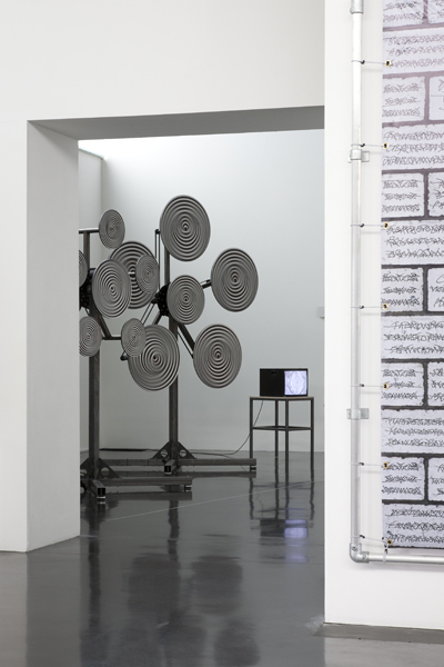
‘Ergo Ergot, 2006, menaces and bedazzles the viewer on a grand scale. A whirling kinetic sculpture at the centre of the work exposes the unreliability of human perception. Part crude experiment, part sensual operation, it’s arrangement of spinning disks tests two scientific hypotheses: The Ebbinghaus Illusion (also known as the “Titchener Illusion’), which maintains that the size at which we see things is dependant on what surrounds them, and the ‘perception-versus-action hypothesis’, which states that visual information is processed in two different streams, one for visual awareness and one for movement. Recalling ‘rotoreliefs’, the optical illusions design by Marcel Duchamp in the 1920’s as well as the logo for the ‘Vertigo’ record label, the rotating disks induce a dizziness in the viewer akin to the moment before a fall. Information is presented against all this spin, in the form of dates that flicker hypnotically in a migraine-inducing animation amidst a pulsating sequence of lurid patterns. These silhouettes are in the shape of a Rorschach psychological test, Ink Blot No.4, which is supposed to subliminally suggest male authority, whilst the speed that they flicker is designed to stimulate the brain’s Apha wave activity, lulling the viewer into a trance-like state. The twenty-two dates depicted derive from Liberty’s ‘Human Rights Legislation Audit’ – a public record of all the acts passed by parliament since 1999 that have worrying implications for human rights. Titchner’s installation suggests that, like our perceptions, our civil rights are not a given but are vulnerable to manipulation.
Titchner’s title conflates the most famous of philosophical statements, René Descartes’s ‘Cogito Ergo Sum’ (‘I think, therefore I am’) with ergo, a poisonous fungus with hallucinogenic properties that was instrumental in the invention of LSD. Consumption of ergo causes the sickness St Anthony’s Fire, which leads to insanity and death in the sufferer. It’s name derives from the visions that tormented the third-century saint, a subject o many artwork and the focus of the French nineteenth century novelist Gustave Flaubert’s life-long work. Flaubert’s The Temptation of Saint Anthony 1874, sees a succession of monologuing deities appear like hallucinatory visions, testifying to man’s powers o invention and to the mysteriousness that reigns everywhere. An early influence on Sigmund Freud, the book also deeply impressed Titchner when he read it at art college, and there are parallels between the succession o fantastical ideas given expression in Titchner’s works and Flaubert’s monstrous visions.
Through it’s insistence on our susceptibility to visions, Ergo Ergot emphasises the unreliability and contingency of the knowledge and codes by which we live. Yet far from discrediting what is visionary, Titchner embraces thoughts that lie beyond the realm of the ordinary in order to show the world in all its perplexity.
Gair Bose, Turner Prize Catalogue 2006, Tate 2006

INSTALLATION VIEW 'BE ANGRY BUT DON'T STOP BREATHING' PA system, microphones, stage, rug, scaffolding, t-shirts, charred wood and fixings, monitor and DVD, loudspeaker, acrylic on canvas, 2011
Be Angry but don’t stop breathing (II) is a new version of a 2003 installation in which visitors were encouraged to engage in a group primal scream exercise which made visual the vibratory nature of sound. For this version however, sculptural elements have been stripped down and simplified, shifting the focus of the work towards a more open, performative piece. The artist invites visitors to use the work as an open public address system, creating a unique and ever-changing soundtrack to the film N (I) B which is shown nearby. The work also contains a hand-painted banner in the style of a traditional trade union banner. Be Angry but don’t stop breathing becomes a rallying cry and a declaration of unity and defiance, encouraging individual expression.
(Text from Exhibition Guide)
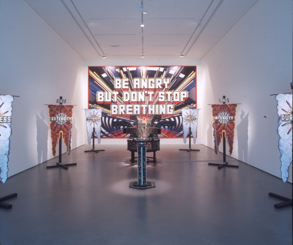
‘In his installation BE ANGRY BUT DON’T STOP BREATHING, Titchner situates the gallery between the experimental forum of the laboratory and the devotional space of the cathedral. Through sculptural and text-based works, he conflates the philosophies of our cult figures whose theories were planted firmly outside scientific orthodoxy: Wilheim Reich MD, Marxist psychoanalyst and pioneer of Orgone energy; Arthur Janov, pioneer of Primal Therapy; Hans Jenny, natural scientist and inventor of Cymatics, and Emmanuel Swedenborg, philosopher and theologian.
The central component of Titchner’s installation is a laboriously hand-carved contraption, the latest in an ongoing series of semi-functional works that explore notions of ritual and devotion. Visitors are invited to shout into one of the six arms protruding from its hexagonal base and watch as their collective screams, with the help of electronic amplification, become a manifest as vibrations in an adjacent tray of liquid. This totemistic sculpture parodies a number of dissonant ideas. Jenny’s theory of Cymatics, the idea that all matter in the universe vibrates and therefore through it’s study we gain a mire complete understanding of existence, is combined with Primal Scream Therapy, a popular misreading of the natural therapy pioneered by Janov in the late 1960’s that linked the repression of mental pain with physical breakdown. A third strand is presented through the introduction of Swedenborg’s proposition that the original communication was a pure expression of divinity from which language was subsequently generated. This further abstracts the procedure into an investigation into the true nature of the word. The sculpture therefore functions as a multi-faceted experimental mechanism, the language of logic applied to an illogical interweaving of theories, which relies on the viewer for activation. Titchner links disparate elements of the installation through the repetition of the hexagon, the graphic symbol for benzene, which is a key solvent used in organic chemistry. The motif is further disseminated through the number six. The six vertical free-standing banners surrounding the sculpture echo in scale and form the religious standards common to churches and cathedrals )a swallow-tailed silk flag suspended from a pole). At the centre of each a hand-carved wooden plaque is inscribed with a single word introduced by the word ‘and’, suggesting an infinite accumulation of information. Contrasting with the roughly hewn surface of the sculpture and acting as a sort of altarpiece for the space, a huge digitally printed banner confidently asserts BE ANGRY BUT DON’T STOP BREATHING. It’s typeface is reminiscent of early computer graphics and is offset by a digitally generated starburst that is an attempt to suggest spiritual redemption and deliverance.
The phrase is taken from the poster for WR: Mysteries of the organism, the controversial 1971 film by Dusan Makavejev loosely based on the life and work of Wilheim Reich. Found text features largely in Titchner’s practice, eclectic phrases pilfered from miscellaneous sources and transformed into philosophical proclamations that seemingly demand a response. However an ambiguity surrounds the tone of the delivery of these phrases as they are presented, devoid of context, as slick graphic posters or lightboxes with the vapidity of mainstream advertising. It is unclear whether we are to interpret them with sincerity, cynicism or humour. Titchner sees these proclamations as a sort of ‘cod-philosophy, scavenged from the collapsed space that used to keep disciplines like philosophy and pop music apart’.*’
Lizzie Carey-Thomas, NOW AND THEN Art at Tate Britain , Tate 2004
* Mark Titchner interviewed by Mark Dickenson in Playing amongst the ruins, Royal College of Art, London 2001, p90
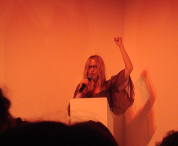
This work also provided the backdrop for the performance ‘Self Portrait with Drum Solo’.
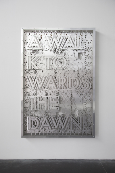
Titchner has recently created a series of layered metal reliefs using steel and aluminium and we are delighted to bring some of these works together for this exhibition. Their bold and emphatic statements derive visually from the language of advertising yet these phrases are culled from a variety of sources. No Them Only Us for example is taken from a presidential address by former US President Bill Clinton. Removed from their original contexts, these statements appear to hover between poignancy and meaninglessness.
(Text from Exhibition Guide)
One of the new works commissioned for this exhibition is a video portrait of Nicholas Bullen, a musician, sound artist and founding member of Grindcore band Napalm Death, a band whose intensely political songs condensed the human voice into primal, guttural screams. The Napalm Death song You Suffer from the Scum album of 1987 is listed in the Guinness Book of Records as the shortest recorded song ever, its duration being less than two seconds. It actually contains the lyrics You suffer but why but these are barely indecipherable beneath what sounds like an emotive, desperate scream.
(Text from Exhibition Guide)
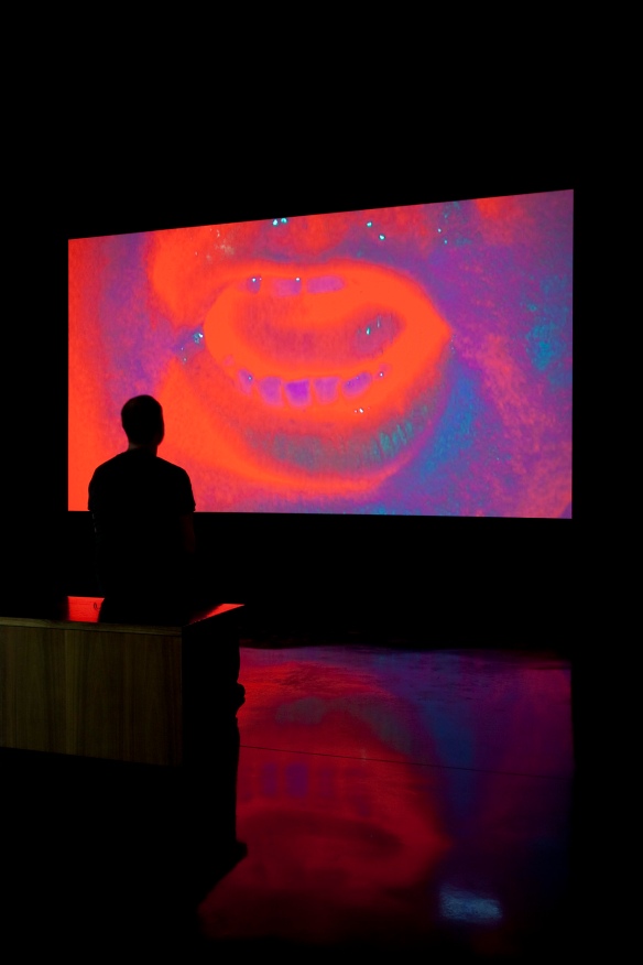
N (I) B is a silent, large scale projection in which we are presented with a close up shot of Bullen’s mouth as he performs a work written by the artist. This work combines a list of LGA banned word s transformed through the use of a Gematria calculator which gives numerical values to words and phrases. The values of the banned words have been calculated and matched with other words and phrases of the same value. The film footage is slowed down to an extreme degree revealing the minute muscle movements that produce sound. The title, N (I) B refers to the Black Sabbath song of the same name (purported to stand for Nativity in Black) and to Billie Whitelaw’s performance of ‘Not I’ by Samuel Beckett . In this seminal work, the actress is filmed reciting a work with the camera focusing exclusively on the movement of her lips, teeth and tongue. In N (I) B, the sound is removed completely.
(Text from Exhibition Guide)
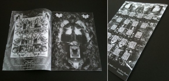
A free fanzine-style publication was produced to accompany the exhibition. An interview discussing the fanzine and DIY aesthetics in general can be found at The Aesthetic Trust. It is reproduced below.
“I’m very much inspired by both the use of language and DIY graphic design. The amateur graphic designer can reach some very interesting conclusions!
“When I was a kid my friend and I used to draw our own comics, which were basically set in the world of 2000AD’s Judge Dredd. We would write our stories and place them in that universe pretty much for our own gratification. I have no idea what happened to any of them. I actually collect religious tracts, which I actually have quite a lot of now and in the most interesting cases are self-published.
“The use of the ‘fanzine’ tag for the publication was just something that took hold early on. Probably because I gave the Curator at New Art Gallery Walsall, Deborah Robinson, a copy of a French fanzine called Conservative Shithead as a present at the beginning of our discussions about the show. ‘Fanzine’ just became shorthand for a publication with a certain kind of aesthetic, the most significant being that there would be no graphic designers involved. It all came from me, as it were. My graphic design sensibilities are probably unschooled at best, and that seems to be the crux of the fanzine – the enthusiasm of an individual for a certain subject.
“Blogs are definitely the new fanzines. I was super enthusiastic about mine when I started it but gradually have felt less and less like I have anything to say and just tend to focus on archiving work. This is partly from ‘blog fatigue’ when you realise there is just so much out there and I don’t really have enough time as it is, let alone just adding to the whole mess of unprocessed information. I question whether there is any real point of adding to the whole mess of information out there. I admire those who are treating this whole phenomenon as something vital, experimental and unexplored though.
“Dennis Cooper’s blog is a good example. One slight issue is with the look of blogs. I mean, WordPress is great and simple (why would you bother with a website now?), but it definitely pushes you towards a certain aesthetic unless you want to start writing code. The QR codes on the back of the fanzine are a kind of further reading, with links to some sites, video, images etc. My main interest in QR codes is to do with the way that language is legible and also its visual encryption.
“It was really interesting to see Nic Bullen’s early fanzines in the Home of Metal exhibition in Birmingham. I was really familiar with some of the images through second hand sources, such as a book on grindcore called Choosing Death, then you see the originals with the Sellotape and the felt pen and it reconnects the whole thing with the reality of where these things were produced. These are objects imbued with the simple necessity to make something, the creative act, which is something very simple and vital. The blogosphere is something else which can be infected with commercial aspirations or the simple desire to be famous….for writing a blog!
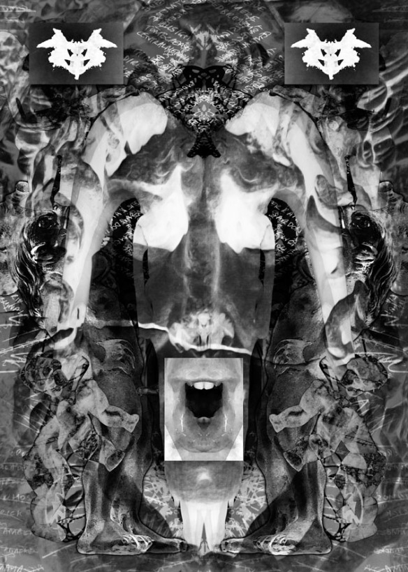
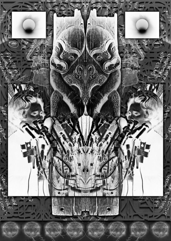
“The intended low-quality production of the fanzine, and the smaller scale compared to some of my other work, didn’t make me feel free to make more mistakes. I spent actually spent a long time on the fanzine. I initially planned to have quite a lot of writing in it, but I found myself so drained from the show (and having a young son!) that I didn’t really feel like writing. Instead the fanzine became a set of complimentary visuals for the show. There is a lot of layering of the reference and working material for the show, so what I ended up needing to make was 16 coherent images that then worked in sequence.
“This involved a lot of back and forth to have some sense of balance between the images. That said I don’t think that I’m that precious about any of the digital works and they have to maintain a certain pace. Generally the rule is: if it takes more than two days it’s not working, so it goes in the bin. There are some exceptions though, like the largest digital work in the show Breezeblock, which took several months to complete. You have to remember when I started making these digital works I had never used a computer before so I was truly an amateur and I’d like to hold on to some of that.
“It’s nice to make something functional, which is of course essential with a publication. When I made the book Why and Why Not? a few years ago the scale of the book was based on the size of a book that you could fit in the back pocket of a pair of jeans. Scale wise, a lot of my work is large and that is because it has a direct relationship to advertising, but actually, during the working process, everything big or small is kind of equivalent as I’m working on a computer screen. That’s quite liberating because everything has a potential to become something else. It is only at the moment of output it is fixed and that could equally be an A4 printer or a 5 metre wide commercial roller printer. There is probably more detail in the in the A4 fanzine than in the large banner that faces out from the gallery. That is because of the close scrutiny that goes with holding something in your hands rather looking at it from a distance.
“I think my text pieces are probably at there weakest when they are read as sloganeering, my idea with these works has always really been to do with the essential emptiness of language. The noisy and baroque works are actually supposed to depict a kind of silence. That is the kind of silence that exists in a situation where you have an absolute array of information let’s say, for arguments sake, horizontally, and in the vertical plane only the surface itself i.e. no depth. Everything has an equivalence but, beyond the point of reception, little longevity. The phrases offer what seems like a lot, but are essentially empty vessels.
“I’m trying to mimic the sensation one gets when you see a new advertisement that is an ecstatic moment of reception and then nothing but unfulfilled desire. I have strayed into the political with some projects because of certain convictions I have, but that has not always served the work well. Generally I have no personal connection with the texts other than they connect with an aesthetic that I need to project. Whether it’s Nietzsche or Britney Spears it’s the same to me as far as source material for the work goes.
“I am interested in the idea of opposition, but often I have to think about what that means in the larger framework i.e. how we can generally be opposed to certain things but then allow them to go on in other forms through structures like economics? How can an artist that engages with the art market be critical of the art market? These are contradictions for us all to face. If you engage you’re in it. That said dissent is good and the fact that a fanzine can be put together with the simplest of means grounds it in the aesthetic of resistance.
“I haven’t really had any feedback about the fanzine, not really. Generally people have said they like it, but it is free! And generally it’s been my friends. If I were a bit smarter I would have put a QR code on the back that led to a site where you could leave feedback.”
A selection of Press and articles relating to the exhibition
An excerpt from Radio 4’s Frontrow on ‘Home of Metal’. Originally broadcast 17/6/2011 the audio on Home of Metal starts at 21 minutes.
THE LAST TEN YEARS
‘The Last Ten Years’ is a video work composed of daily headlines from the New York Post/Herald Tribune running from the 1st January 2000 to 31st December 2009. The typeface used in the piece is based on the font created for the London 2012 Olympics.
The running time of the final work is just under 2 hours. It was originally shown at Vilma Gold Gallery London in 2010 and publicly in Thessaloniki in 2011
DEPTFORD X 2
THE VALUE OF THINGS: EXPENSIVE TEA TOWEL OR CHEAP ART?

Is £45 a lot of money for a Tea Towel? Is £45 a lot of money for a silkscreen print on fabric from an edition of 50? What does this teach us about value systems and the nature of capital? I don’t know. I designed a tea towel for the good people of Studio Voltaire and there fund-raising pop up store, House of Voltaire. Click here to check out this weeks stock and other art/utility conundrums. If anyone has actually used one of these to do the drying up, please let me know how it went…
IVY MEET MIKE
What do the following have in common?
Smiling Buddha, Canopus, Tumbler-Snapper, Buster-Jangle, Dominic, Tsar Bomba, Teapot, Wigwam, Grapple X, Joe 4, Ivy Mike?
Answer: BANG!!
For all your queries about Nuclear Weapons…
Remember the Cold War, the very real threat of Global Nuclear Armageddon?
